Mitochondria are important organelles in eukaryotic cells. They are powerhouses to generate cellular energy in the form of ATP and are essential for a many cellular metabolic and signaling functions. Over 1000 proteins localize to mitochondria and participate in carrying out these essential cellular processes.
MitoXplorer is a web-platform that allows analysis and visualisation of the dynamics of genes involved in mitochondrial functions (mito-genes), with the aim to discover how their expression and mutation landscape varies in different experimental and disease settings.
To provide users with a meaningful analysis, we have manually curated a mitochondrial interactome for different species, which consist of mito-genes with hand-curated functional annotations and protein-protein interactions. With the data from our database or your own data, you can use mitoXplorer to map expression and/or mutation data to the interactome, perform analysis such as Comparative Analysis, Principle Component Analysis or Hierarchical Clustering, and visualise the results in a dynamic and interactive way.
For detailed instructions on how to use mitoXplorer 2.0, please turn to our video tutorials by clicking on TUTORIALS in the menu bar.
The mitoXplorer database
The database of mitoXplorer is currently hosting mitochondrial interactomes of four organisms, Human, Mouse, Drosophila and Budding Yeast. Each interactome consists of 1000 or more genes, which we have manually curated, annotated and grouped into 38 mitochondrial functions. Protein-protein interactions were downloaded from the STRING database. Every gene is manually curated and annotated with its functions by our team based on available literature and is grouped to one of the 35 mitochondrial processes, which represents the main role of the gene within mitochondrial functions, such as Apoptosis, Oxidative Phosphorylation, etc. Interactomes from more organisms will be available soon. We also constantly update available interactomes with more genes and detailed annotations.
The mitoXplorer database also hosts processed data from public repositories, such as Gene Expression Omnibus (GEO) or paired samples from the Cancer Genome Atlas (TCGA). We are also expanding it with more public data from difference sources. Count data from RNA-seq experiments are transformed to TPM (Transcript per Million) and Log 2 fold change is calculated for each dataset (Diseased over Normal Control). Pre-analysed data are taken as provided by the authors.
Users’ guide
MitoXplorer is a web-tool and its usage requires no installation or programming knowledge. It can be accessed with any common web browsers. Users must enable javascript in their browsers to allow interactive visualisations to be displayed smoothly.
Databases: the mitochondrial Interactome and public datasets
The mitochondrial Interactome
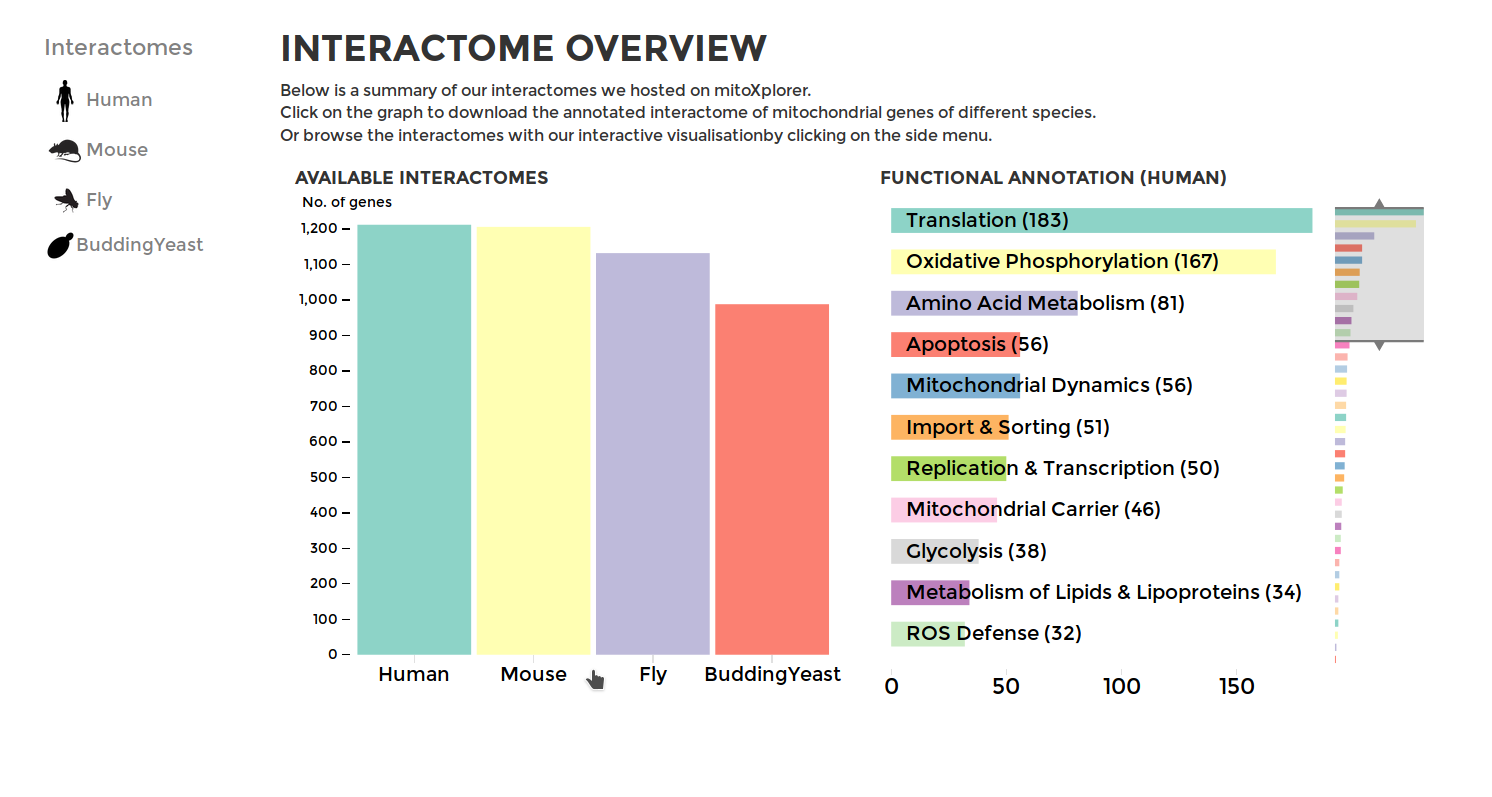
To browse through our interactomes or download them, go to INTERACTOME on the main menu. You will see the summary of all our data from mitochondrial interactomes, including the mito-processes and number of genes associated with them. To download an interactome, simply click on the bar of the your species of choice. Selecting a species from the side-bar by clicking on the name of the species or its icon will display a summary of the genes within mito-interactome (all the mitochondrial functions and the number of associated genes) and our public database.
Working with the mitochondrial interactomes
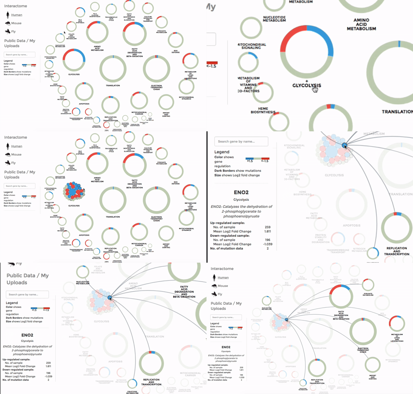
The genes within the interactome are grouped by their mitochondrial processes. Click on a mitochondrial process to reveal the genes it contains. Hover over the genes to see their interactions with other genes, as well as the annotations at the bottom-left corner. Below the annotation, you can also find a summary of the combined expression and mutation data of that gene (the number of up-regulated and down-regulated datasets, mean Log 2 fold change and number of datasets with mutation). The gene is coloured by the Log 2 fold change. (Left)
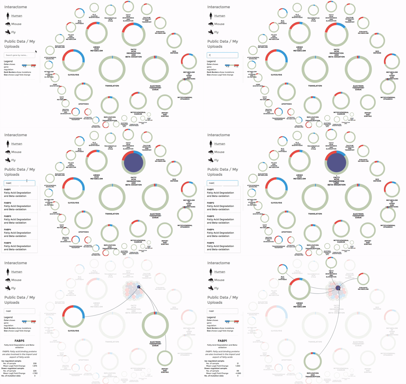
You can also search for a particular gene with the FIND A GENE function on the left panel. Enter the gene name or parts of it and all the matches will be highlighted on the interactome. (Right)
The Database of public datasets
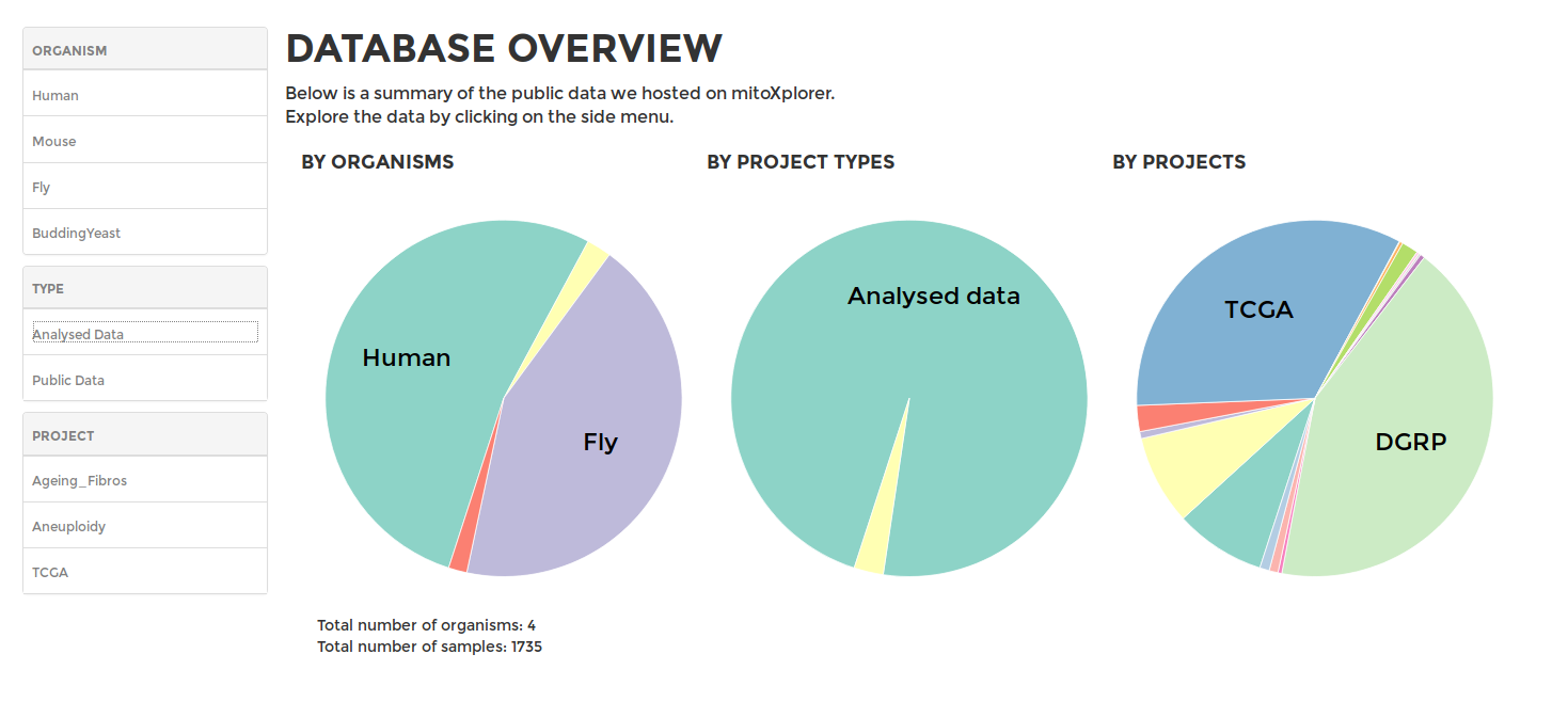
To browse our public data hosted on mitoXplorer, go to DATABASE on the main menu. You will see a summary of the data available in our database, including the available organisms, as well as available datasets for each organism. On the sidebar, you can choose to browse the datasets of the different projects from available organisms, including data from GEO or the TCGA.
Browsing public data
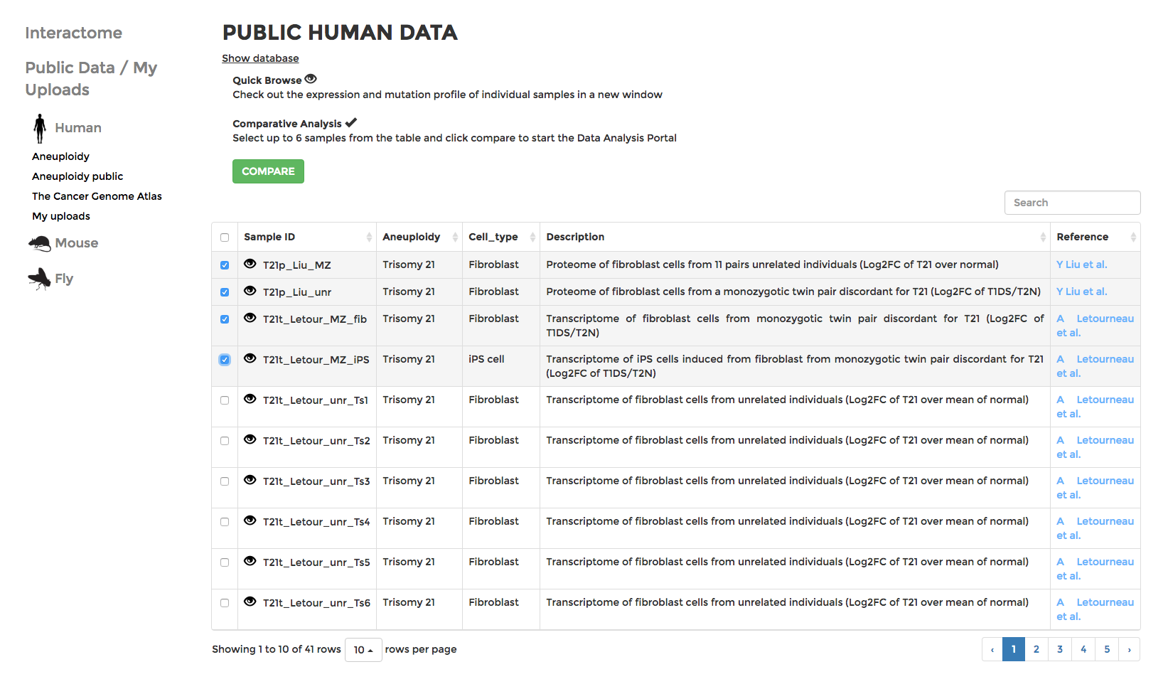
Data are grouped into various projects under different organisms. If you have uploaded your own data, they should appear in “My uploads” (see Upload for details). Datasets with descriptions are displayed in tables. You can search for datasets with keywords (cell type, cancer type, etc) or sort them by columns of different attributes. Click on the next to the name of each dataset to visualise the expression data in the form of the interactive mitochondrial Interactome. Or choose up to 6 datasets and click COMPARE, which will lead you to the ANALYSIS page and visualise the datasets with an interactive Comparative Plot (see Analysis).
Analysis
With the analysis tools provided by mitoXplorer, multiple datasets can be analysed and visualised with various interactive graphs.
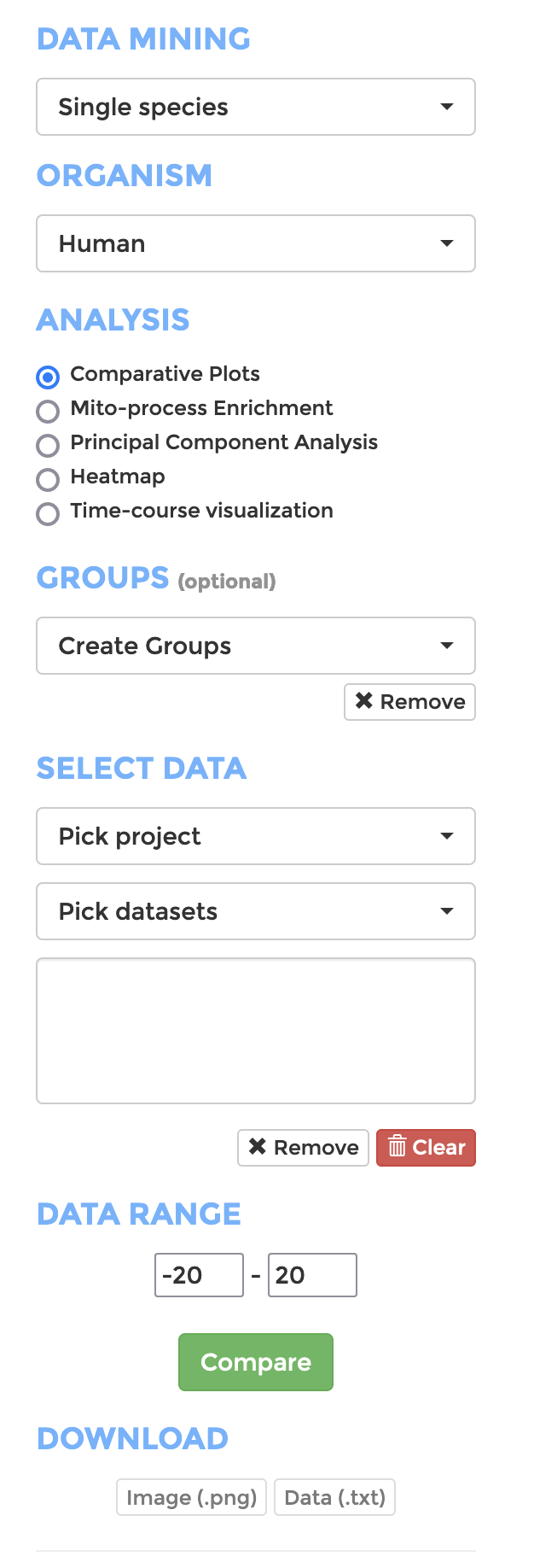
To start, go to ANALYSIS on the main menu, and configure your analysis on the side panel. (shown on right)
- Data Mining: Choose if you want to analyse a single species or perform cross-species comparison
- Organism: Choose the organism your data belongs to
- Analysis: Pick the analysis you wish to perform (See sections below for details).
- Groups: If you want to analyse your data with groupings, create groups and add datasets to the group.
- Select Data: Choose datasets from a range of projects of the selected organism.
- Data Range: Define the range of expression value (Log 2 fold change of TPM) that should be displayed or included in the analysis.
- Click “Compare” when you are all set and the analysis will appear on the right panel.
The visualisation of all types of analysis (or the data in text format in some analysis) can be downloaded with the download buttons on the side panel of the pages.
Comparative Plots
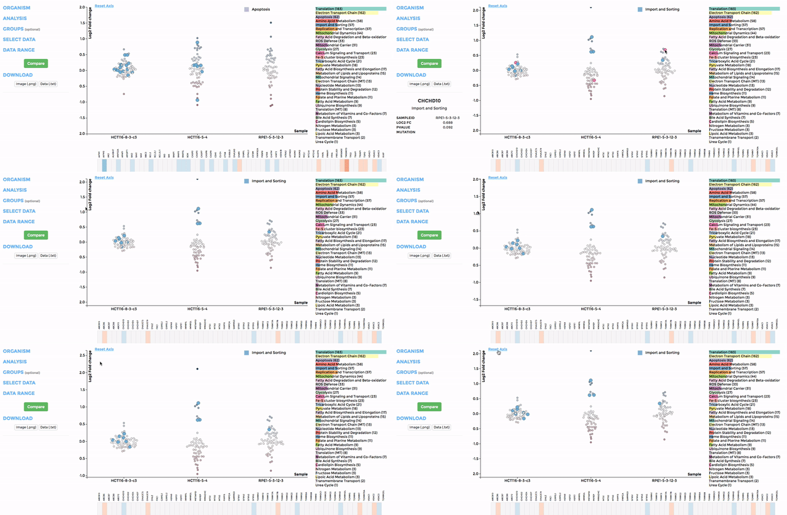
Up to 6 individual datasets (or 6 groups of datasets) can be visualised simultaneously in the interactive scatterplot, bar-chart and heatmap that make up the Comparative Plots. Click on the bar-chart to choose the mitochondrial process you would like to visualise with the scatterplot and heatmap.
In the scatterplot, each dot represents a gene that is associated with the chosen mitochondrial process. The y-axis is the Log 2 fold change and the x-axis is the dataset (or group). Hover over the gene of any dataset to see the annotation of that gene, and its expression/mutation data in that dataset (or the summary of that group if grouping is performed). The gene will be highlighted in all other datasets as well.
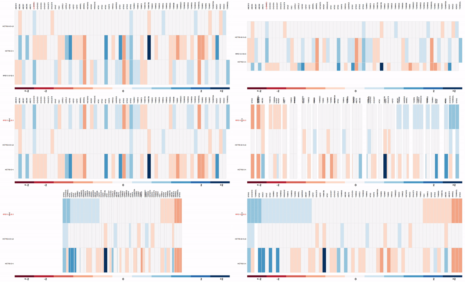
The data in heatmap mirrors the ones in the scatterplot. Hovering over any cell will highlight the corresponding gene on the scatterplot. Click on the name of any gene to sort the datasets (rows) by Log 2 fold change; and the name of any datasets to sort the genes (columns) by log2 Fold change.
Mito-process Enrichment
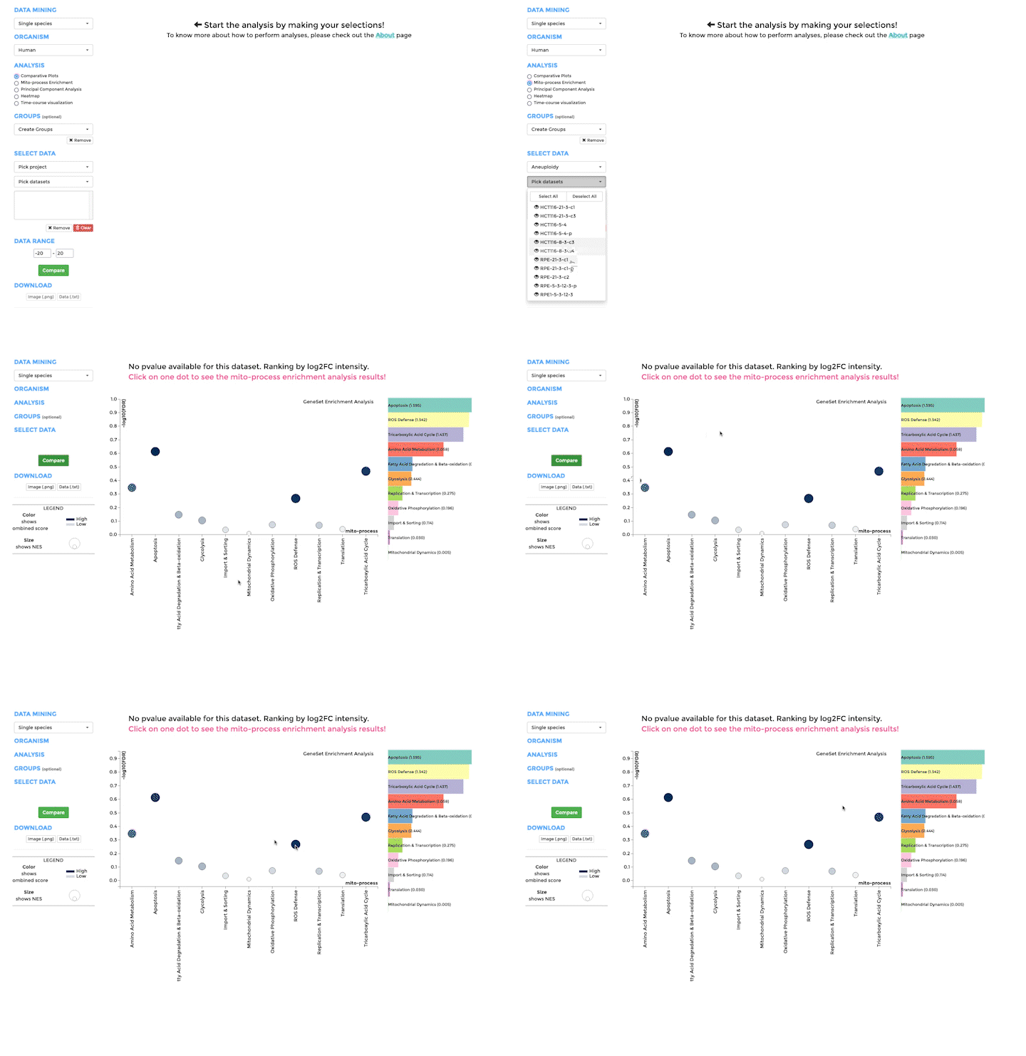
You can use MITO-PROCESS ENRICHMENT to identify enriched mitochondrial processes (mito-processes) based on our annotations in your dataset. We use Gene Set Enrichment Analysis (GSEA) to identify enriched mito-processes.
Principle Component Analysis
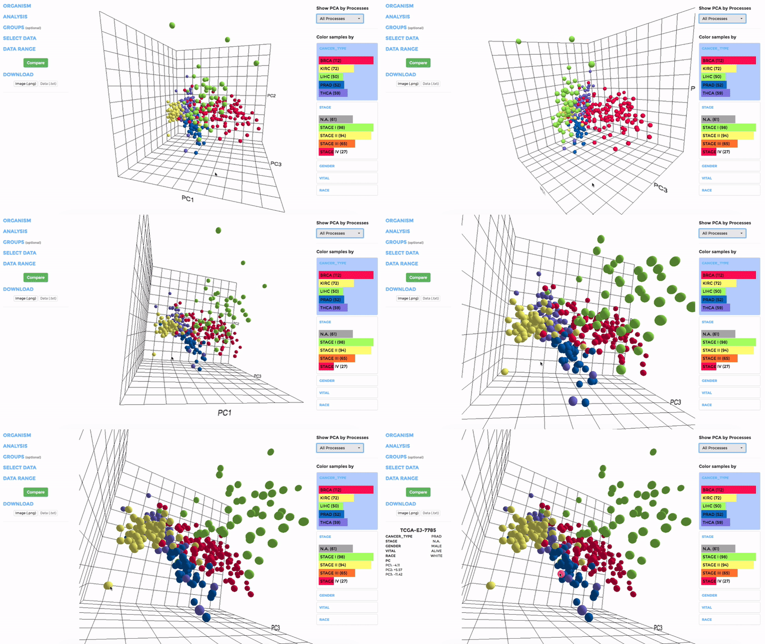
Principle Component Analysis (PCA) transforms multidimensional data (in this case, each gene is one dimension) to different principle component (PC), in such a way that the first PC has the largest possible variance. This approach can help users to find possible clusters among datasets using data with many variables (i.e. expression data of many genes).
The analysis can be performed on up to hundreds of datasets. The first three components will be visualised with a 3-dimensional graph. Each dot represents a dataset and the distance between dots reveals how similar they are to each other regarding the expression (Log 2 fold change) of mito-genes. Users can move the plot in 3-dimensional space, zoom-in or -out by dragging and scrolling with their mouse. Hovering over a dot (dataset) will show the details of that dataset (the first three PCs, the attributes or grouping).
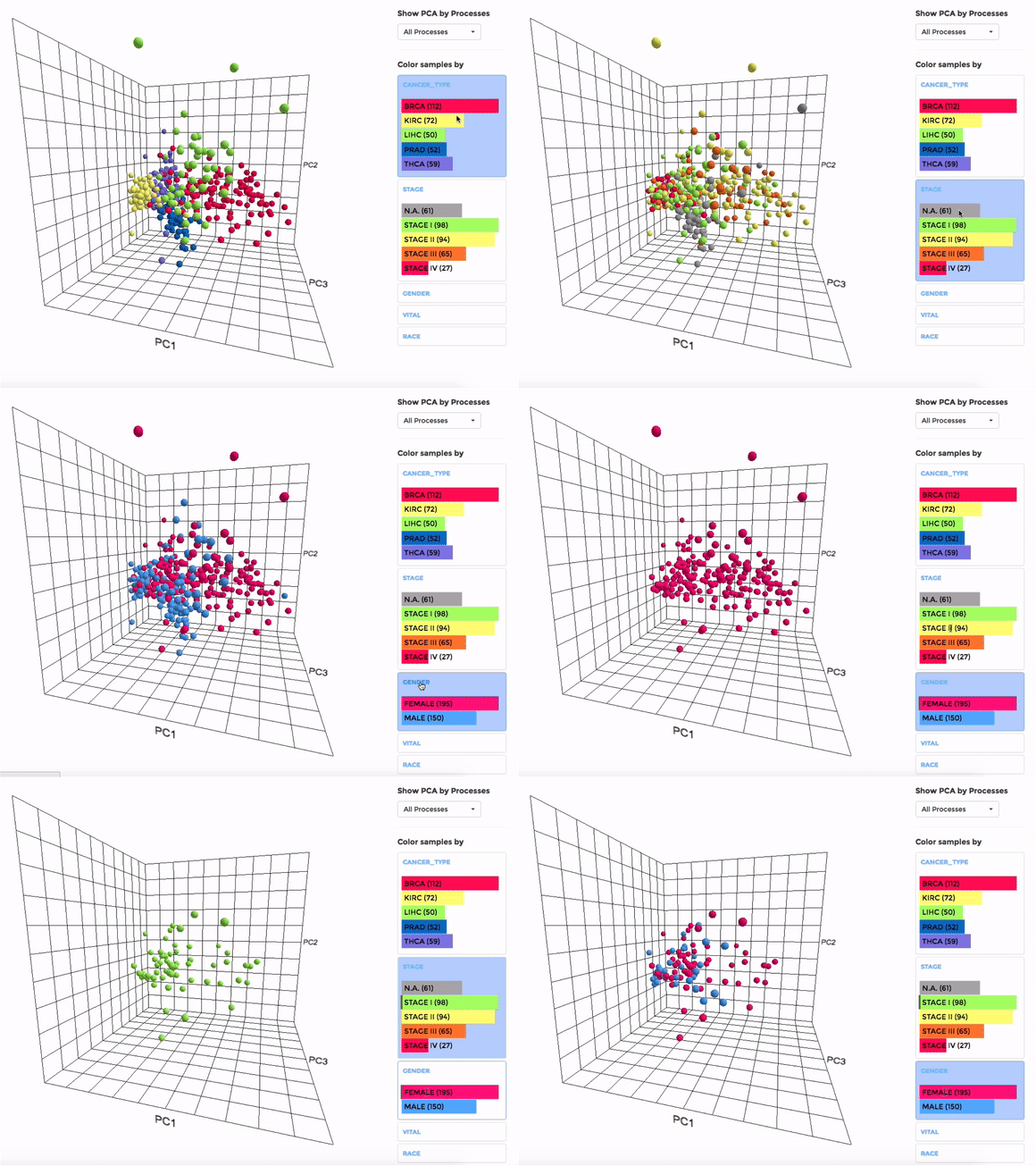
If the selected datasets have more than one attribute, users can choose to colour the dots according to different attributes at the right panel. Datasets can also be filtered by clicking on target group(s) (the filter will be cleared when de-selecting the group).
Users can also choose to perform PCA on all mito-genes, or on genes associated with a particular mitochondrial process (“Show PCA by Processes”), to see how the datasets cluster when analysing different groups of genes.
Heatmap
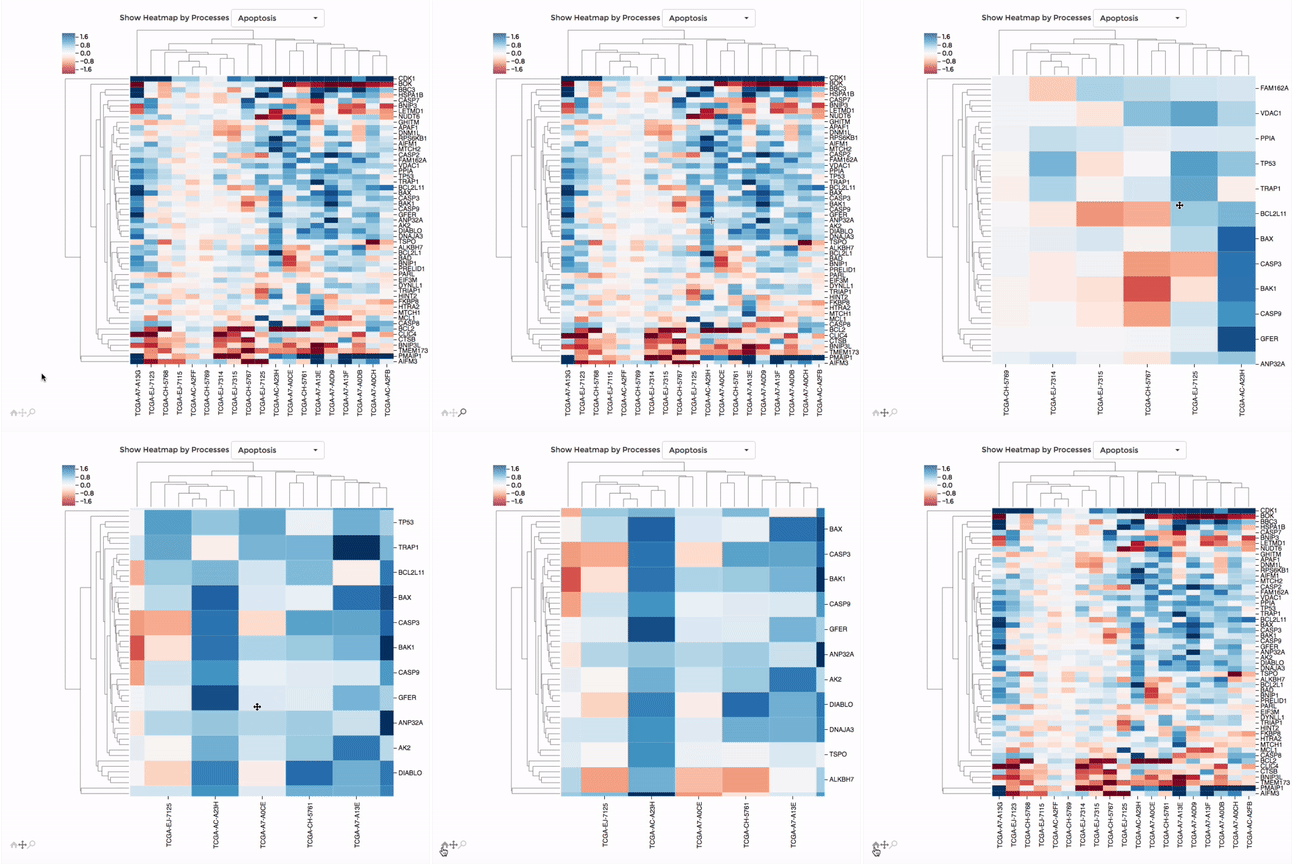
Up to 100 datasets can be analysed and visualised in the form of clustered heatmap.
Hierarchical clustering is performed for genes belong to the same mitochondrial process (“Show Heatmap by Processes”).
The interactive graph allows users to zoom-in/-out and move around the heatmap. Hovering over a cell will show the detail of that gene and dataset.
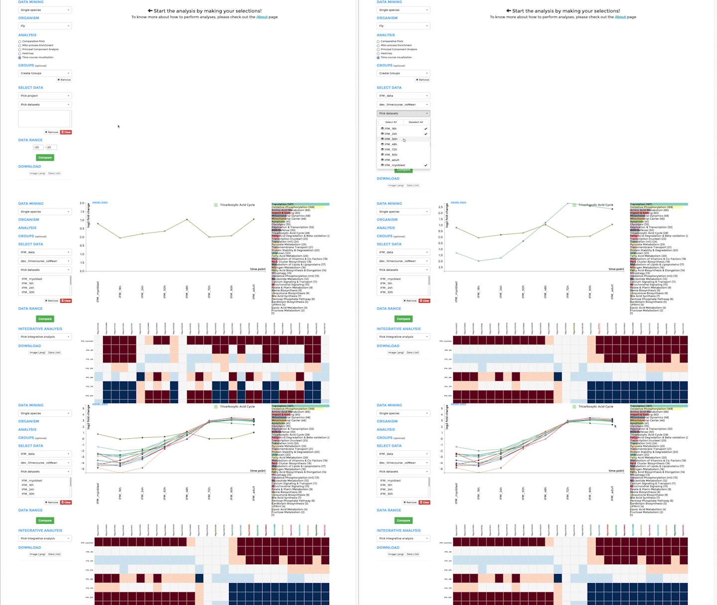
Time-course visualization
We have created time-course visualization to visualize time-series data. With time-course visualization, you can compare up to 20 datasets, overcoming the limits of the comparative plots. We have changed the scatterplot to a line plot, connecting one gene across time and showing its temporal expression dynamics. You can pick the genes you want to visualize in the line plot from the bar plot. Note that you need to provide pre-analysed data. Either use a differential expression analysis software to compare one time-point to the next, or compare the expression of a gene at one time point to its mean over all time points. Alternatively, you can also upload standardized data from classical time-series analysis packages, like the R-package mfuzz.
Results Integration
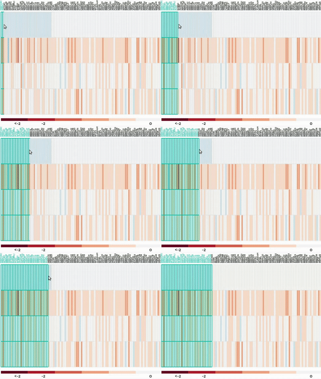
Thanks to mitoXplorer interoperability, after performing the Comparative Plots or Heatmap analysis, you can further investigate you results. You will just need to select your genes of interest, from one of the heatmaps provided for the visualization. Then you will choose the integrative analysis you want to perform among the available ones and mitoXplorer will directly send you to the resource of interest.
TF-Enrichment
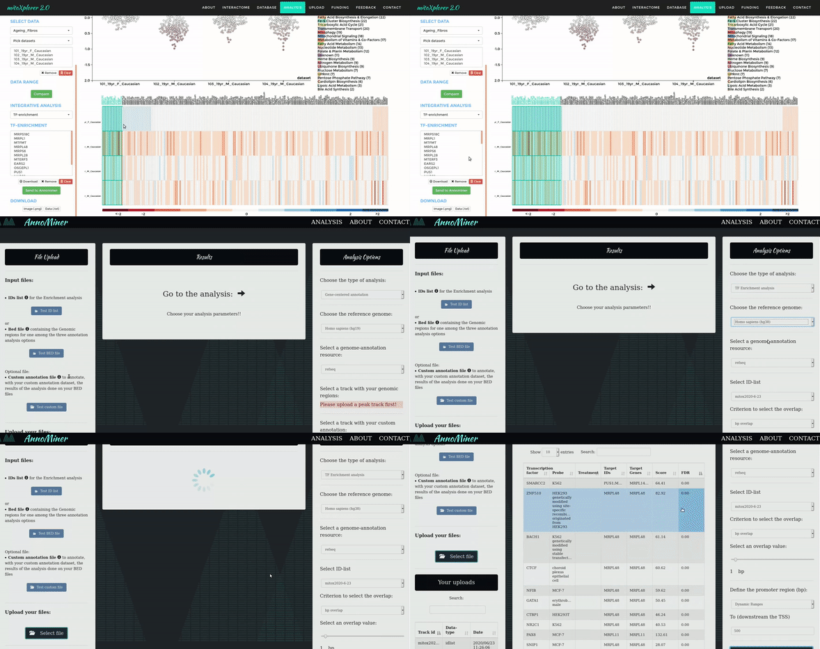
After you visualize the mito-genes which are perturbed in a particular condition, it would be interesting to investigate if these genes are potentially co-regulated by the same Transcription Factors (TFs), so, if they are sharing the same regulation mechanism as potential explanation of the observed deregulation.
To accomplish this task we developed AnnoMiner, a web based tool to perform TF-enrichment analysis. With a click, you can directly send the genes of interest from mitoXplorer to Annominer and perform the analysis.
Network Analysis
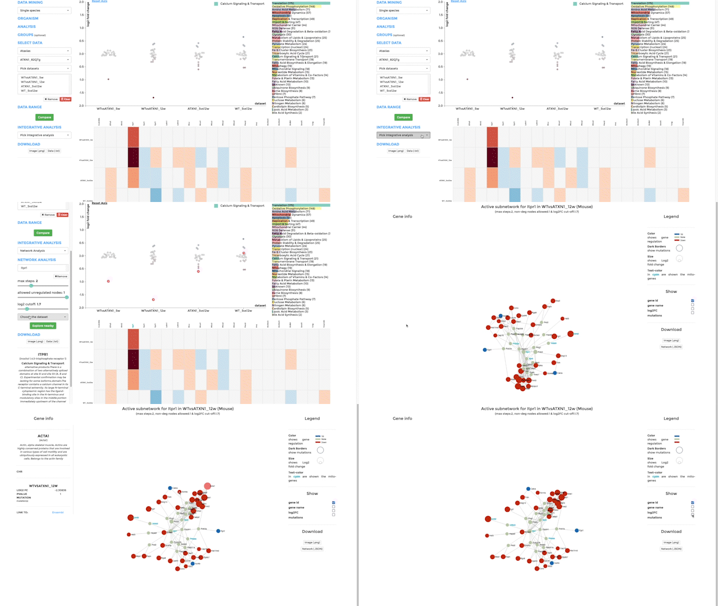
Our second integrative functions allows you to perform network analysis, embedding the mitochondrial interactome into the cellular interactome and finding potential active pathways. We store the entire cellular interactome in our database for this purpose. What you need in addition is a dataset, which has been uploaded – or is available – on mitoXplorer. We use the viPEr algorithm (Garmhausen et al., https://doi.org/10.1186/s12864-015-2017-z) for active subnetwork extraction surrounding a single mito-gene, which you can select from comparative plots, heatmap or time-course visualization.
Upload data
You can upload and visualise your own expression (and mutation) data on mitoXplorer.
Prepare your data in the format documented on the page “UPLOAD”. mitoXplorer accepts comma or tab-separated files, as well as excel files. Save your text files in unix format, to avoid upload errors (you can use a text editor like bbedit) for this.
MitoXplorer currently accepts data from Human, Mouse, Drosophila and Budding Yeast.
Once your data is uploaded, it will appear under “My Uploads” on the page “DATABASE”.
Please go to “UPLOAD” for instructions on how to upload your data.
Your data will appear in the database pages; select the organism of your data, then ‘analysed data’ and your data will have the name ‘user_upload’. Likewise, you can access your data directly from the analysis page, where you can choose your dataset from the drop-down menu (user_upload).